Charts Tell Us That Gold Prices Could Soar Later
The gold market recently witnessed selling. The yellow precious metal now trades at around $1,290 an ounce after trading above $1,300 for several months.
The $1,300 level was considered a major support level for gold prices. With this, investors could be asking what’s ahead for the precious metal.
Looking at the charts, there could be short-term misery, but the long-term outlook for the metal looks shiny.
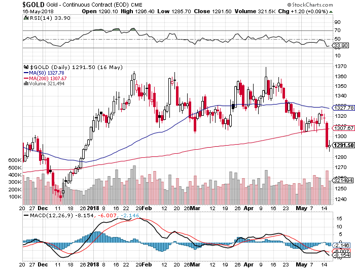
First, please look at the daily gold chart below. The price has broken below its 50-day moving average (blue line) and the 200-day moving average (red line).
These moving averages are used as trend indicators. If the price is below the moving averages, it means that short-term and long-term trends are pointing downward.
We see this happening now; this is bearish for gold.

Chart courtesy of StockCharts.com
Also, since $1,300 was considered a major support level, technical analysis suggests that, when a support level breaks, the price tends to drop to the next closest support level.
The next support level for gold prices isn’t until $1,240.
If you look at the momentum indicators like the moving average convergence/divergence (MACD) oscillator—plotted at the bottom of the chart—and the relative strength index (RSI)—plotted at the top—they both suggest that sellers are increasing in numbers and that they could take the price of gold lower.
Don’t Focus Too Much on the Daily Fluctuations
Investors beware! If you are too focused on what’s happening in the short term, you could be making a big mistake.
Nothing has really changed when you look from a long-term perspective. Gold looks bullish. Pay very little attention to the daily fluctuations.
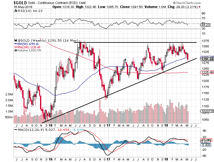
See the weekly gold price chart below.

Chart courtesy of StockCharts.com
There are three things to watch on the chart above.
1. Gold prices continue to trade above their 50-week moving average and their 200-day moving average. This suggests that short-term and long-term trends are pointing upward. Also, note that the 50-week moving average has been acting as a support level since mid-2017. This says that investors are using this level as a buying point.
2. Since 2016, we have been seeing the formation of a chart pattern called an ascending triangle. It forms when there’s a preceding uptrend and there’s a resistance level that the price finds difficult to move above. It’s drawn on the chart above.
You see, it’s a bullish chart pattern, and the price eventually breaks above the resistance level. When that happens, there’s a rapid move to the upside. This could be the case for gold as well. Right now, $1,375 is the resistance level, and it’s worth watching.
3. Notice the volume plotted behind the price? It continues to increase as gold prices trend higher. This says there are buyers, and that they are excited to buy.
Don’t Ignore the Gold Miners
Dear reader, in the midst of all this, it’s important to keep a close eye on gold mining companies.
In the short term, if the price of gold ends up dropping, mining stocks could become even more attractive.
Why? It wouldn’t be shocking to see investors sell them if precious metals prices drop.
Mining stocks are already selling for pennies on the dollar, and they are now in much better shape than they were in the previous bull run in the gold market. Lower gold prices would make them even more compelling.


